Design · Brand
Brand identity for explorers.
A coherent identity — logo, colour, type, and a usage system — so every map, deck, and release looks like one company.
From $2,500
Selected Marks
Logos we’ve drawn.
What you get
One company,
one look.
We build a complete identity — wordmark, colour palette, and type system — with guidelines and templates that make it easy to apply. The result is consistent work across every map, deck, and release.
Logo & wordmark · Colour & type system · Brand guidelines · Templates · Rollout.
Selected Work
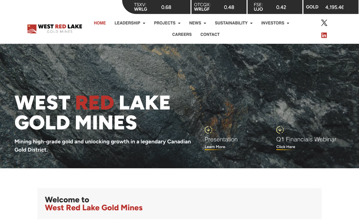
West Red Lake Gold — from mark to rollout.
A new company restarting an old mine needed an identity that read as a miner, not a promoter. We drew the mark and wordmark in 2023, then carried them across everything the market sees — booth, fact sheet, deck, website, and roughly ten news-release maps a month since.
Ready to look like one company?
Tell us where your brand stands today and where you want it.
Book a discovery call- 20 min, no obligation, no pitch
- Not raising yet? Get your materials scored — free, no call →